Objective
To utilize type as a means of creative
visual communication. To learn Illustrator production techniques
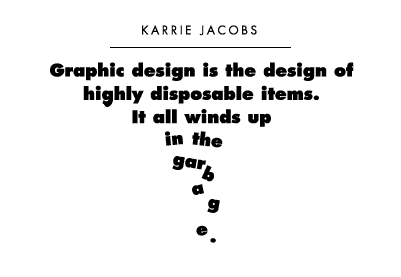
by recreating the example below.
Discussion
Text type is supposed to be invisible, designed to convey the
message of the author in the most direct way possible. Reading
text type should be effortless and unintrusive. However, headlines
need to get attention. Creative manipulation of typographic elements
to enhance the message will often be more memorable than just choosing
the appropriate font. Often, this will involve creating an illustration
with typographic elements. By involving the reader and engaging
them in thinking about the visual helps to communicate the message
in the design.
Procedure
preparing for the exercise
- download starter file
- open "quotes.doc" in word
- select the first quote, copy to clipboard
- launch illustrator
- file > new: letter, portrait
- save as "quotes.ai"
- type tool: point type (single click on art board), paste
creating the first quote in illustrator
- select all text, make futura extra bold, centered, 16/22
- select author, make futura book, all caps, 13pt, tracking=100
- add RETURNS for proper line breaks
- pointer tool: duplicate text block (opt+drag)
- type > create outlines
- ungroup (cmd+shift+G), then regroup select objects (cmd+G)
- create layout per sample
- save
create another quote
- choose another quote from the word file (or browse to
www.brainyquote.com to find your own quote)
- sketch out concepts in your sketchbook
- execute your idea in illustrator (choose your font carefully)
- print out your conceptual quote for small group critique
- revise your design based on feedback (if necessary)
grading
- add your name and the exercise number to both files
- clean-up your printable area and add credit.
In 9pt Helvetica, 1/2" from bottom and right side of the page add:
Exercise #: Exercise Name
Your Name
- print proofs for grading
- file your graded proofs in your Process Book for individual review
