
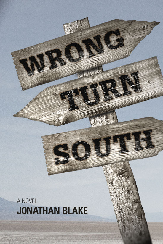
Objective
To learn Photoshop production techniques by example. To learn Photoshop filters, lighting effects, and adjustment layers by recreating the book cover above.
Discussion
Low budgets sometimes requires Photoshop to become a photo studio. In this case, we use a wiki creative commons image and one stock photo, both modified to fit the concept. By adding a rendered light source, noise, and blur shift, we make the separate elements appear cohesive—part of the same environment. Adding appropriate effects to type can amplify the meaning. Photoshop can also act as a layout tool when using a limited amount of type.
Procedure
prepping the landscape photo
- download starter files
- open 'landscape.psd' in Photoshop
- save as 'book.psd'
- practice Adobe navigation keyboard shortcuts: space = hand; space+cmd = zoom in; space+cmd+opt = zoom out; cmd+zero = fit in window
- examine layers, note adjustment layer
- cmd+click 'layer 1' thumbnail to make selection; image > crop
- image > size = 6x9 inches (resample=no; note ppi)
- delete 'layer 0'
- rename 'layer 1' as 'bg'
- save
adding the type
- open 'sign.psd'
- examine layers, note changes made to the image
- delete 'original' layer
- reset foreground/background colors (D)
- add point type 'WRONG' (Glypha LT Std 75 Black)
- rotate, resize, adjust position, adjust tracking
- duplicate layer; change type, repeat
- select 3 type layers: layers > merge layers (hold down opt to make a copy)
- rename merged layers 'type'
creating the wood burn effect
- select 'type' layer
- layer styles > blending options:
• blend if > underlying layer (option+click to split left slider: 0, 153, 227) - outer glow:
• blend mode = normal
• opacity = 75%
• spread = 5
• size = 24px
• color = dark gray/brown (eye-dropper)
- save; save as 'map.psd'
creating and adding displacement map
- reveal only 'modified' layer; flatten image
- layer > adjustments > hue/saturation > saturation = 0
- layer > adjustments > brightness/contrast > increase contrast
- save, close
- open 'sign.psd'
- select 'type' layer
- filter > distort > displace > scale = 7/7: 'map.psd'
- layer > merge visible (or RMB)
- save as 'sign-merged.psd'
blurring the sign
- open 'book.psd'
- file > place linked > 'sign-merged.psd'
- scale, rotate
- filter > blur > blur gallery > tilt shift > blur = 9px, adjust to blur the bottom of the post only
adding lighting effects
- filter > render > lighting effects:
• spot
• intensity = 40
• hotspot = 44
• ambiance = -37 - move to left; scale larger
adding noise to background
- new layer 'noise', move above 'bg' layer
- edit > fill: contents=50% gray
- filter > convert for smart filters
- filter > noise > add noise: gaussian, amount = 10
- filter > noise > median = 1
- change 'noise' layer mode to 'overlay' (gray becomes invisible)
- duplicate 'noise' layer, move copy to above 'sign'
- option + click between 'noise copy' and 'sign' (creates clipping mask)
- decrease opacity of 'noise copy' layers
adding author and tag line
- add point type 'A NOVEL' (Univers LT Std 47 Light Cond), color = sample dark brown, kern type
- dupe type layer, change type to your name (Univers LT Std 67 Bold Cond), adjust kerning
- move type layers to top, adjust size and position
- save
grading
- add exercise number on the PSD file
- layer > flatten image; image > mode > CMYK
- file > save as (format = JPEG; quality = 10)
- open the JPEG in Photoshop and print a proof for grading
- file your graded proof in your Process Book for individual review