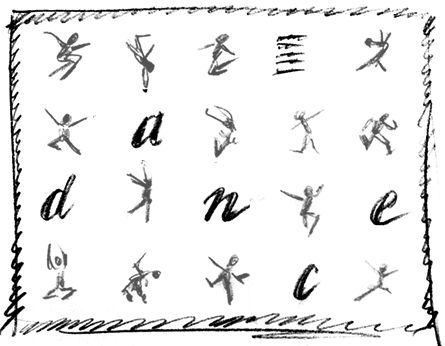
Objective
To interpret another designer's concept
sketch. To review typography hierarchy systems. To learn print
production techniques by creating a press-ready digital file for
a poster based on the sketch below:
Procedure
preparing for the exercise
- download starter files
- inspect downloaded files
- open PSD file in photoshop
- create shadow to match JPEG files
creating the layout
- in InDesign, create a new one-page document (22x17 inches)
- import EPS logo file; inspect color palette
- import JPEG images, size and position
- import text, select appropriate fonts
- create letters to spell out "dance"
- choose appropriate colors
- add border
- print color proof for critique (reduced to fit 17x11 inches)
- print "full-size" color proof for critique (tiled
to fit two 17x11 pages)
- submit tiled paper proof with your name on it for grading
- file graded proof in your 3-ring binder for individual review
general checklist: preparing files for the printer
- add bleeds (if needed)
- create "rich blacks" (i.e. 100K+50C) (if needed)
- preview printing plates (window > output preview)
- check scaling, resolution, color mode of images (scanned and
vector)
- check colors (CMYK vs Pantone), delete unused colors
- spell check (edit > check spelling)
- add your name to bottom of file as a "slug" (optional)
- file > package: package (look for warnings)
- file > PDF export presets: press quality (bleeds, printer's marks)
- also see www.thepremierprintgroup.com/preflight.php
