Archived copy for reference only

(Archived from 2019)
To apply design principles to ad layout. To be introduced to Adobe Photoshop and InDesign's production and typesetting tools by recreating this ad:
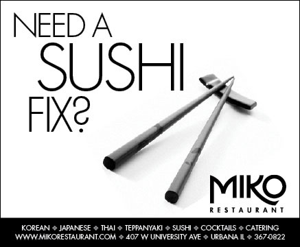
The art of advertising is a creative endeavor. Creative concepts sell because they grab attention and are more memorable. A typical way to sell sushi is to show the product. A more creative way is to suggest that sushi at Miko is so good that it's addictive. Which approach will be more memorable?
A good concept can be destroyed by bad execution. A good execution involves the application of design principles. This ad is unified by proximity and repetition (only one font is used). There is emphasis by size or shape (depending on your interpretation). It is asymmetrically balanced by shape. There's not much rhythm, but there is depth by shadow.
Because most newspaper ads are b&w, the imagery must be very carefully chosen. Simple images work best. Some subjects (like food) does not show up well in b&w. Partial page ads are usually placed next to other ads, so adding white space will help your ad stand out.
Most newspaper ads are sold by the column inch. Some newspapers sell full inches while others may allow half-inch depth. For The News-Gazette's specifications, download their technical spec sheet .
Overview: Convert color photo to b&w, import art into InDesign, add type.
Prepping the Photoshop file
Typesetting and layout in InDesign
BACK TO TOP
Last updated:
5/7/21