Objective
To learn InDesign typographic refinement techniques by recreating this postcard:
Discussion
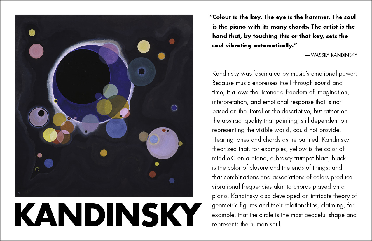
Wassily Kandinsky was an influential early modern painter who also taught at the Bauhaus. Although his work is classified as "fine art," many graphic designers admire his daring experiments in abstration and his contributions to the Gestalt theories which are now taught as "design principles" in all art schools.
Procedure
- download starter files
- launch InDesign
- file > new > document (cmd+N): print: page size="half letter" (51p0 x 33p0);
pages=2; facing pages=no; columns=2; gutter=2p0; margins=2p0; slug=3p0 (bottom)
- master page: add your name and exercise number to the bottom (in slug area on); return to page 1
- file > save as "kandinsky.indd"
typesetting the front of the postcard
- file > place kandinsky.jpg: aligned with top margin, scale to fit column width (cmd+shift+drag)
- file > place kandinsky.doc in the right column
- new paragraph style "text": 10/12 Futura Book; hyphenation=off
- object > text frame options: vertical align=justified
- cut and paste "Kandinsky" from right column to new text frame below image
- right column: add RETURN after quote to push the reference to the next line
- spec quote: bold (cmd+shift+B ),
reduce size by 1pt
- spec reference: 9pt all caps, align right (cmd+shift+R)
- select text frame; type > story: Optical Margin Alignment=yes
(note hanging quote)
- adjust alignment: increase "align based on size"; adjust kerning
- adjust text frame width for optimum line breaks
- select "Kandinsky" under image, spec bold (cmd+shift+B),
all caps (cmd+shift+K)
- adjust tracking and kerning (opt+LEFT or RIGHT), increase size to fill column width (cmd+shift+< or >)
- force the K to align with the image, hang the diagonal of the Y
- preview the card (W)
typesetting the back of the postcard
- go to page 2
- file > place museum_details.doc (cmd+D)
- apply "text" style
- center text (cmd+shift+C)
- cut/paste indicia info into its own text frame (6px6p, stroke=.75pt)
- set indicia: 8/11
- object > text frame options: vertical justification=center (both text frames)
- main text frame: line 1: 24 pt, bold (cmd+sift+B), all caps (cmd+shift+K), track/kern (opt+LEFT or RIGHT)
- line 2: 13/13, change en-dash to em-dash (opt+shift+HYPHEN)
- line 3: delete superscript
- line 5: change superscript to normal (cmd+shift+PLUS)
- dates + "Museum Hours": bold
- Museum Hours: change HYPHENS to en-dashes (opt+HYPHEN); remove the periods in "a.m." and "p.m."
- type > insert white space > thin space: before/after all dashes (cmd+opt+shift+M)
- slect all: window > character: kerning=optical (note space before/after "1")
- preview the card (W)
fine-tuning the layout
- file > print (duplexed):
• printer=D018 color laser
• set up: page positioning=centered
• marks
& bleeds: crop marks=yes, include slug area=yes
• click PRINTER: two-sided=yes, short edge binding
- submit color proof with your name and exercise number on it for grading
- file your graded proof in your Process Book for individual review
