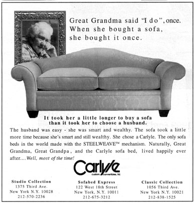
Objective
To review design principles as it relates to advertising. To learn
InDesign production techniques by revising the newspaper ad below
for Carlyle.
Discussion
In order for advertising to work, the message must be clear. The
designer's job is to arrange the visual elements in such a way so
that the concept in the ad is conveyed with integrity. The above
ad actually ran in The New York Times. There are probably at least
a dozen problems with this ad. By discovering what the problems
are, we can learn from someone else's mistakes.
Procedure
preparing for the exercise
- download starter files
- launch InDesign
- file > new: letter, portrait, margins=0
- save as "carlyle.indd"
- file > place "template.jpg", rename layer "template"
- window > transparency: 50% opacity, lock layer
- new layer "box", draw box to match template, stroke=1pt
- new layer "text", file > place "sofa.txt"
- compare text
- select all, choose a font
- split text into logical units, delete unwanted
text
- new layer "pix", file > place "sofa.tif" and logo
- rough out layout
considerations for layout
- how do you retain unity?
- what is the hierarchy of information?
- how many fonts do you need?
- how many sizes do you need?
- how many weights do you need?
- create an alternate version with greater emphasis
- print both ads and compare
grading
- submit b&w laser proof with your name on it for grading
- file graded proof in your 3-ring binder for individual review
- export JPEGs of both ads (150PPI, quality=high)
- open JPEGs in Photoshop
- crop, file > save for web (preset=jpeg high, image size=800px wide)
- publish JPEGs as a link from your projects page
