Objective
To explore the grid as a visual organization tool. To learn Illustrator production techniques by recreating the following flyer for a film screening at New York City's Museum of Modern Art (MoMA):
Discussion
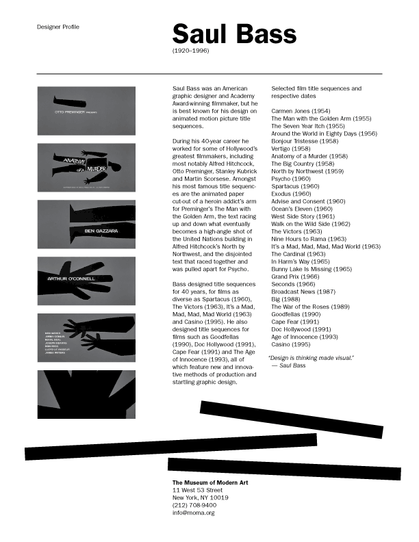
Saul Bass was an influential designer who designed many ground-breaking film title sequences for directors like Otto Preminger, Alfred Hitchcock and Martin Scorsese. In this classic 1958 title sequence for Anatomy of a Murder, Bass used simple graphic images and creative abstraction to design a modern title sequence that still influences designers today.
Grids have been popular in graphic design since the 1930s and they are still an essential tool in both print and web design today. With careful positioning of visual elements, we can achieve a balanced design that is also clean and minimalist — which is exactly the desired look-and-feel for a modern art museum. We will achieve this look by using a very limited palette of visual elements and the following guiding principles:
- utilize the grid as an organization tool
- maximize unity with repetition (font, size, weight)
- minimize typographic variety by using only two weights and two sizes
- use subtlety when creating emphasis
and hierarchy
- use restraint when violating the grid for visual interest
Technical note: Illustrator's type tool has two modes: point type and area type. In this exercise, we will be using area type exclusively because area type snaps to grids beautifully (more info).
Procedure
prepping for the exercise
- download starter files
- file > new (profile=print, size=letter portrait)
- save as "bass.ai"
- rename "layer 1" as "type"
- Illustrator > preferences > guides & grids: grid line every 1 inch, subdivisions=4
- view > show grid
- view > snap to grid
- practice Adobe navigation keyboard shortcuts: space = hand; space+cmd = zoom in; space+cmd+opt = zoom out; cmd+zero = fit in window
adding type
- file > place "bass.txt" into a text frame (area type)
- spec type: ITC Franklin Gothic Book 9/11
- split type into logical frames (5 total)
- make select type Demi
- make head 40pt
- rough out page
adding art
- new layer: "art"; lock other layers
- file > place: all JPEGs
- align and distribute
- group (cmd+G) and scale (shift+drag corner)
- draw 1pt rule
- draw black bars (temporarily turn off snap to grid and smart guides)
- stretch, re-position, rotate
fine-tuning the type
- change quote to italics
- window > type > paragraph: flyout > roman hanging puctutation
- change -- to "em" dash (select hyphen, mouse over)
- change "(1920-1996)" to "(1920–1996)" ("en" dash)
- adjust leading (opt+UP or DOWN arrow)
making your own layout
- art board tool: dupe current page by opt+dragging the page
- re-arrange the elements into a new design (tip: utlize the same principles we have learned in class)
grading
- add your name and the exercise number to each page
- save, save as "bass.pdf" ("smallest file size" for web publishing)
- save as "bass-large.pdf" ("high quality" for printing)
- print a b&w proof of both pages for grading
- file your graded proofs in your Process Book for individual review
- publish "bass.pdf" as a link from your Process Page
