
Objective
To learn Illustrator production techniques. To master Illustrator's type tool by recreating the poster shown.
Discussion
The grid is a wonderful way to organize information. Alignment helps create a sense of visual unity. Careful positioning of elements on a grid will help balance a design. Playful violation of the grid creates variety. Grids have been popular in graphic design since the 1930s and they are still an essential tool in both print and web design today.
Technical note: Illustrator's type tool has two modes: point type and area type. In this exercise, we will be using mostly area type because text frames snap to grids beautifully (more info).
Procedure
Prepping for the exercise
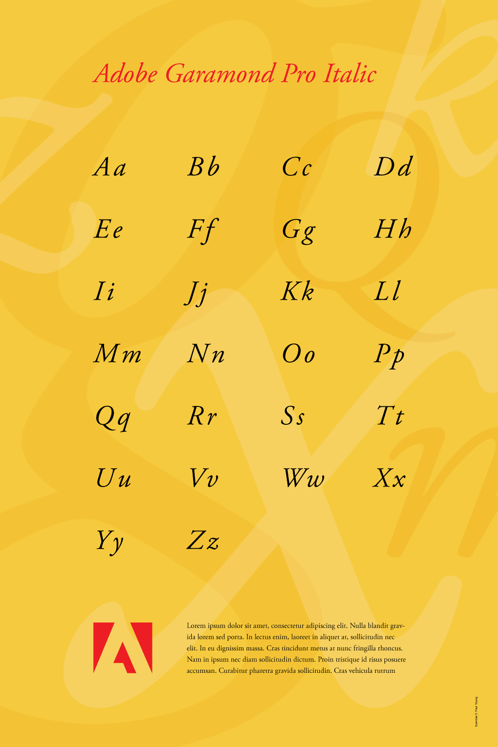
- download the Adobe logo; open PDF file in Illustrator
- file > new (profile=print, size=24x36 inches)
- save as "garamond.ai"
- add new layers (bg, art, type, logo)
- Illustrator > preferences > guides & grids: grid line every 3 inches, subdivisions=2, grids in back=yes; units > general: inches
- view > show grid (show/hide = cmd+')
- view > show rulers (show/hide = cmd+r)
- view > snap to grid (shift+cmd+')
- practice Adobe navigation keyboard shortcuts: space = hand; space+cmd = zoom in; space+cmd+opt = zoom out; cmd+zero = fit in window
Prepping the logo
- go to "logo" layer, lock others
- copy/paste Adobe logo (just symbol) into "garamond.ai"
- window > transform: reference point=BL corner
- position logo 4.5 inches from left, 3 inches from bottom
- make logo smaller (3 inches tall)
Adding type to the grid
- go to "type" layer, lock others
- type tool (click and drag, w=3in, h=1.5in): "Aa" (font=Adobe Garamond Pro Italic, size=96, tracking=100)
- window > transform: reference point=TL corner
- align to grid: 7.5 inches from top, 4.5 inches from left
- copy 4 times horizontally, each 4.5 inches apart (opt+shift+drag)
- select row, copy vertically 3 inches apart (opt+shift+drag)
- objects > transform > transform again (cmd+D)
- replace "Aa" with the rest of the alphabet
- add headline "Adobe Garamond Pro Italic" color=red (eye dropper logo red, tracking=0)
- type tool (click and drag large text frame on paste board)
- change "Lorem ipsum" text from italic to roman, tracking=0
- adjust font size (cmd+shift+< or >) and leading (opt+up/down arrow)
- move frame into position, resize, snap to guides
- type > fill with placeholder text (if needed)
Adding background art
- go to "bg" layer, lock others
- rectangle tool (single click): 24 x 36 inches, reposition
- fill with yellow: C=0 M=19 Y=87 K=0 (or choose you own)
- window > swatches: save current color (click NEW)
- duplicate color: adjust hue and/or saturation (flyout)
- select > unused, delete (flyout)
- go to "art" layer, lock others
- type tool: single click: "g" (italic)
- dupe point type object (opt+drag)
- type > create outlines (cmd+shift+O)
- scale art and fill with color (experiment with white)
- window > transparency: adjust opacity (try 15%, 30% 45%)
- add additional characters as needed
- object > arrange > bring to front/send to back (cmd+shift+[ or ])
- select > object > stray points
Grading
- add your name and the exercise number to the page (10pt Helvetica, 3/4 inch from the right and bottom)
- file > export for web: preset=GIF 32 no dither, image size=1000px wide (for student show submissions)
- save, save as "garamond_small.pdf" ("smallest file size" for web publishing)
- save as "garamond_large.pdf" ("high quality" for printing)
- print a color proof on tabloid (11x17) paper for grading (fit to page)
- file your graded proof in your Process Book for individual review (folded in half with art on the outside, 3-hole punch the outer edge)